FOODWISE
Manage your groceries, minimize food waste, and contribute to your community with FoodWise
Introduction
This project is meant to showcase my design and thought process. I divided it in seven stages:
Identifying the Problem: I start with a deep dive into the issues people are facing. It’s about understanding the core of the problem through direct.
Understanding Users: Next, I focus on truly getting to know the users. Using interviews, surveys, and direct observations, I gather insights that become the backbone of our design process.
Idea Generation: With a solid grasp of user needs, I move on to brainstorming. This stage is about creativity—thinking up various ways to solve the problems. I then select the most viable solutions based on what I’ve learned from the users.
Designing the Solution: Here, I take the best ideas and turn them into tangible designs. Using Figma, I develop everything from the initial sketches to fully interactive prototypes. This process ensures our designs are both intuitive and visually appealing.
Testing and Improving: Testing the designs with actual users is crucial. Their feedback allows us to make necessary adjustments, ensuring that the final product is not just visually appealing but truly meets user needs.
Developer handling: Collaboration with developers and other team members is key to bringing our designs to life. I use Figma and a tools like Linear for tickets to ensure a smooth transition from design to development, focusing on clear communication and detailed documentation.
Continuous Evolution: The launch of our product isn't the end, it's part of an ongoing process. After release, we continue to gather user feedback, analyze how the product is used, and identify areas for improvement. This cycle of testing, learning, and iterating ensures that our product not only stays relevant but also keeps getting better.
Problem Statement
2a. Identifying the Problem
Many people often find themselves throwing away uneaten food because they forget it's in their fridge or pantry, or they miss the expiration date. This not only leads to a significant amount of food waste but also contributes to unnecessary spending on groceries that aren't consumed.
2b. Initial thoughts, hypotheses & goals
Initial Thoughts
⤑ Food waste at the consumer level is a significant issue, often due to poor inventory management at home.
⤑ People might be unaware of what they have in their homes or when items expire.
⤑ There's potential for a solution that helps track food inventory and expiration dates in a user-friendly manner.
Hypotheses
⤑ Many individuals unintentionally waste food because they lose track of what they have bought or when it expires.
⤑ A tool that helps people easily track their food inventory and expiration dates will reduce the amount of food wasted.
⤑ People prefer a digital solution to help manage their food inventory over traditional methods like manual lists or memory.
Goals
⤑ Understand the extent of food waste due to forgotten inventory or expired products in households.
⤑ Identify the most common challenges people face in managing their food inventory.
⤑ Explore the acceptance and preferred features of a digital solution for managing food inventory and expiration dates.
Understanding the user
For this project, I utilized one exploratory method: interviews.
These interviews were unstructured and open-ended, allowing for a comprehensive understanding of user behavior.
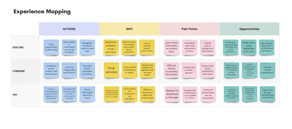
To keep this user research concise and avoid delving into excessive detail, I have not included the individual user interviews. Instead, I present the findings from them, which led to the identification of three user personas:
⤑ User Persona 1: The Eco-Curious Novice
⤑ User Persona 2: The Busy Eco-Warrior
⤑ User Persona 3: The Practical Student
Among these personas, I decided to focus on the first two. The Practical Student, due to their limited interest in environmental causes and preference for using fewer apps, may not be the ideal fit for this project's emphasis on reducing food waste and enhancing community sharing features.
The findings are available on the following Miro Board:

Idea generation
Idea: Food Tracking and Sharing App
A user-friendly app designed to help you manage your groceries, minimize food waste, and engage with your community by tracking your purchases, alerting you to expiration dates, suggesting recipes for leftover ingredients, and enabling you to donate or rescue surplus food within a community-driven platform.
4a. Sitemap
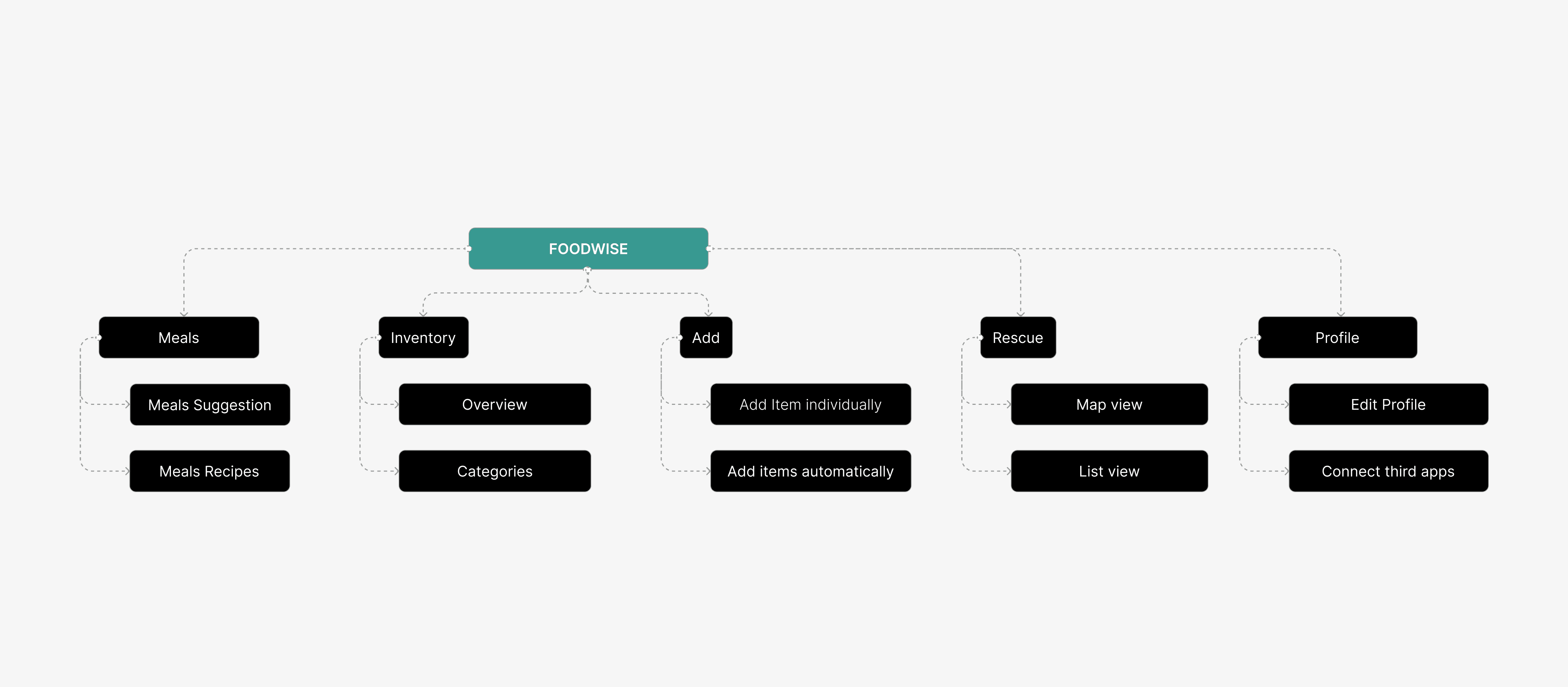
I designed a sitemap that outlines the necessary features to kick off the project:
⤑ Inventory: Keeps track of all your food items and their expiration dates.
⤑ Add: Allows you to input new items.
⤑ Rescue: Enables you to donate or claim food from others that's about to expire.
⤑ Meals: Provides suggestions for meals you can prepare with what you have.
⤑ Profile: Contains options to customize your profile.
4c. Low-fidelity wireframes
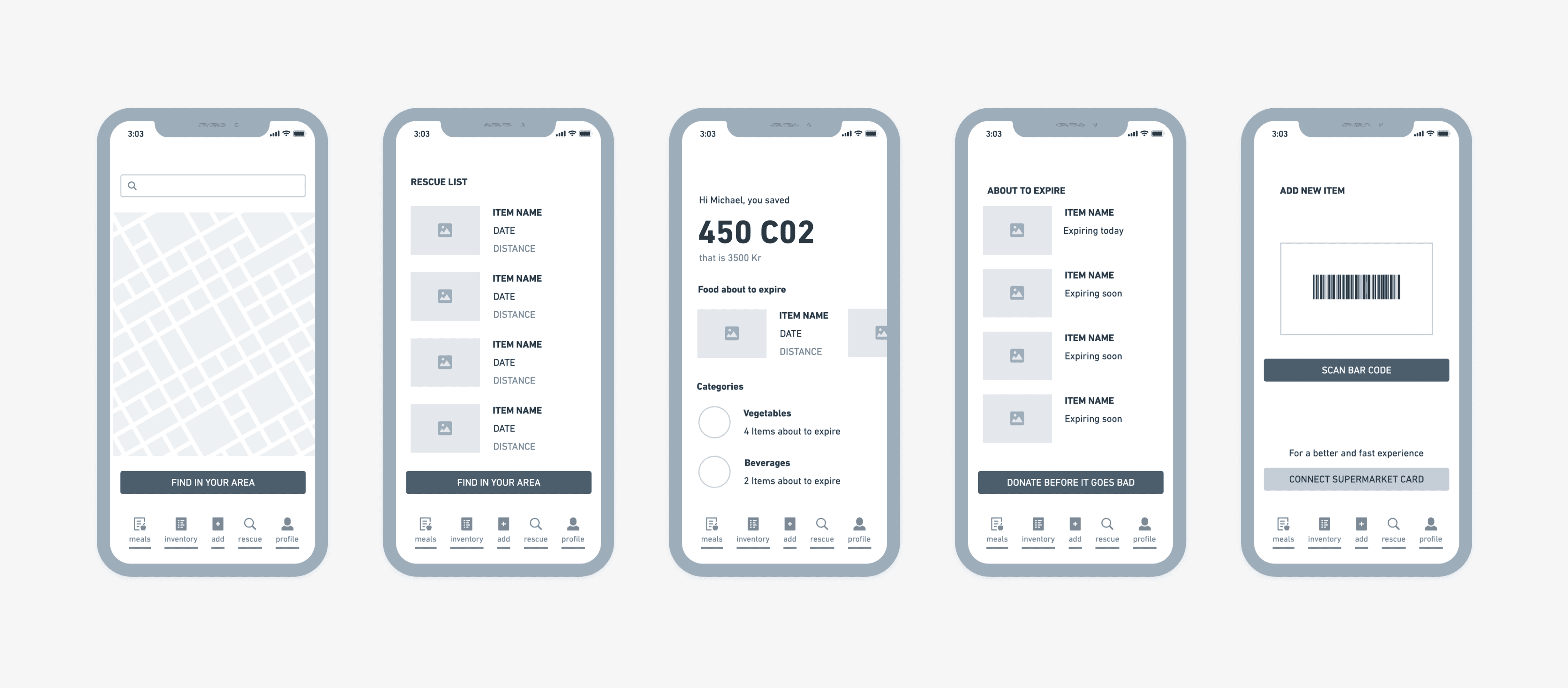
With the sitemap laid out, I start creating wireframes for the initial screens, which will serve as a roadmap for developing the rest of the features.
Designing the Solution
5a. Brand Identity & Components
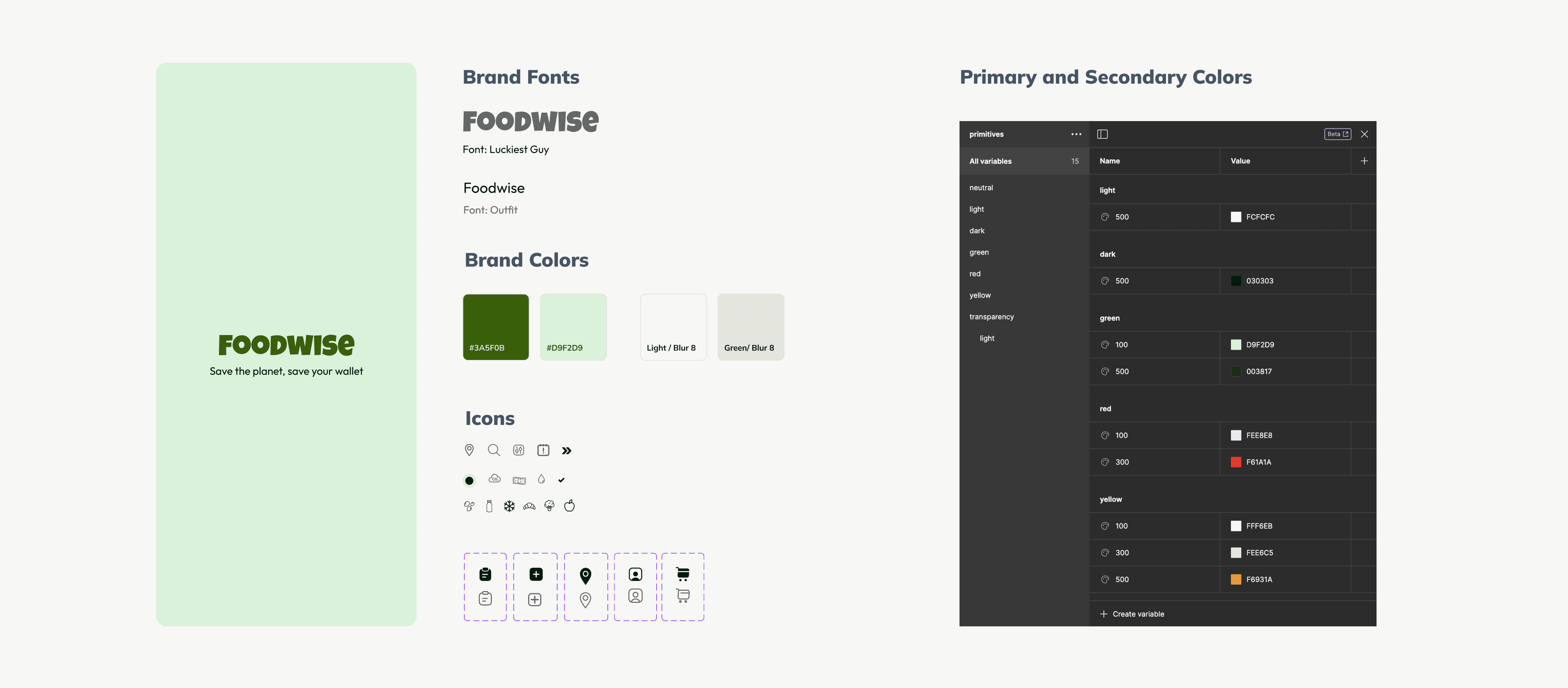
Using the user persona as guidance, I began shaping the brand's visual identity, focusing on color choices and typography. In line with color psychology principles relevant to this project, I selected various shades of green to symbolize sustainability and tranquility. After setting the primary colors, I proceeded to develop the rest of the color palette.
5b. Components
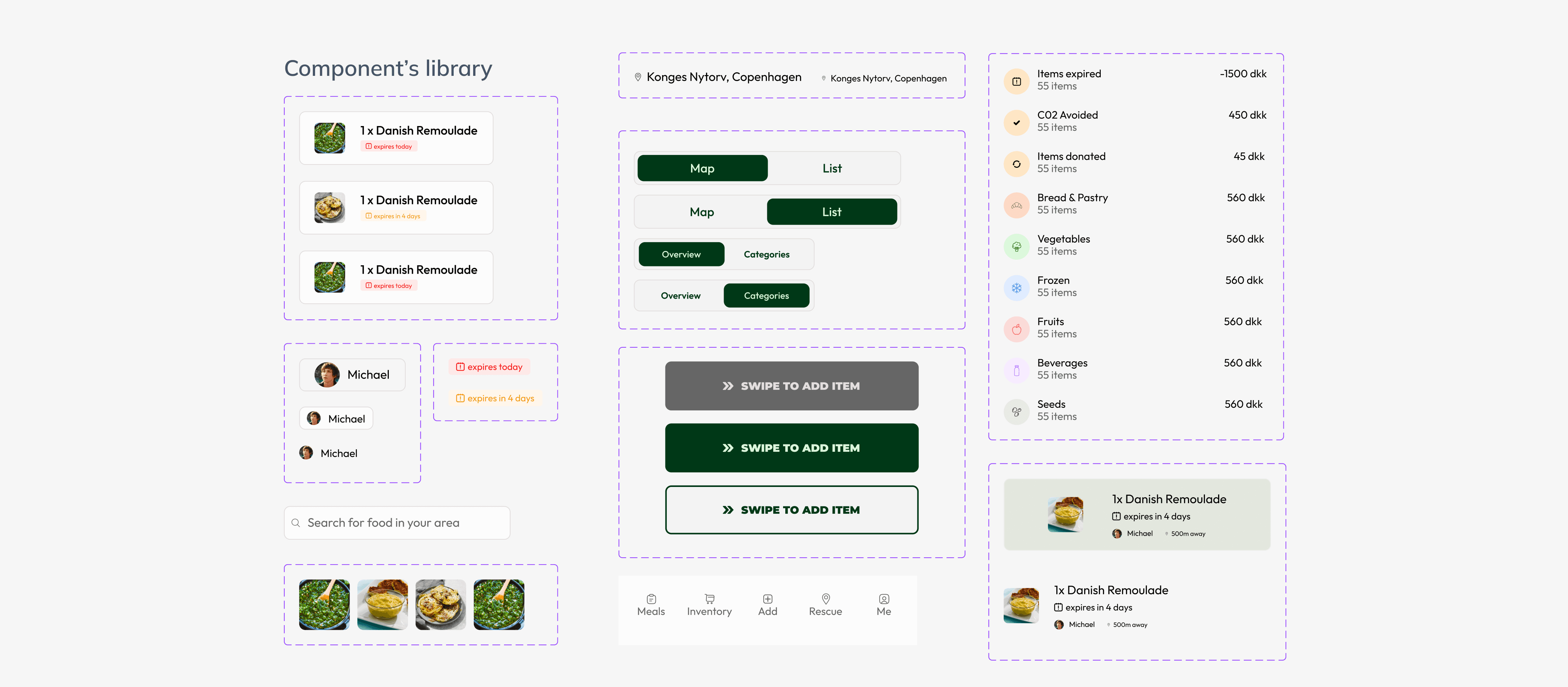
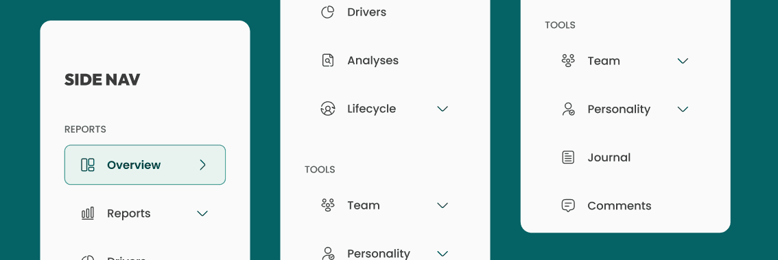
After selecting the typography and colors, I moved on to designing the reusable components for the project.
5c. Hight Fidelity designs
Once satisfied with the wireframes, I transition to crafting the final designs.
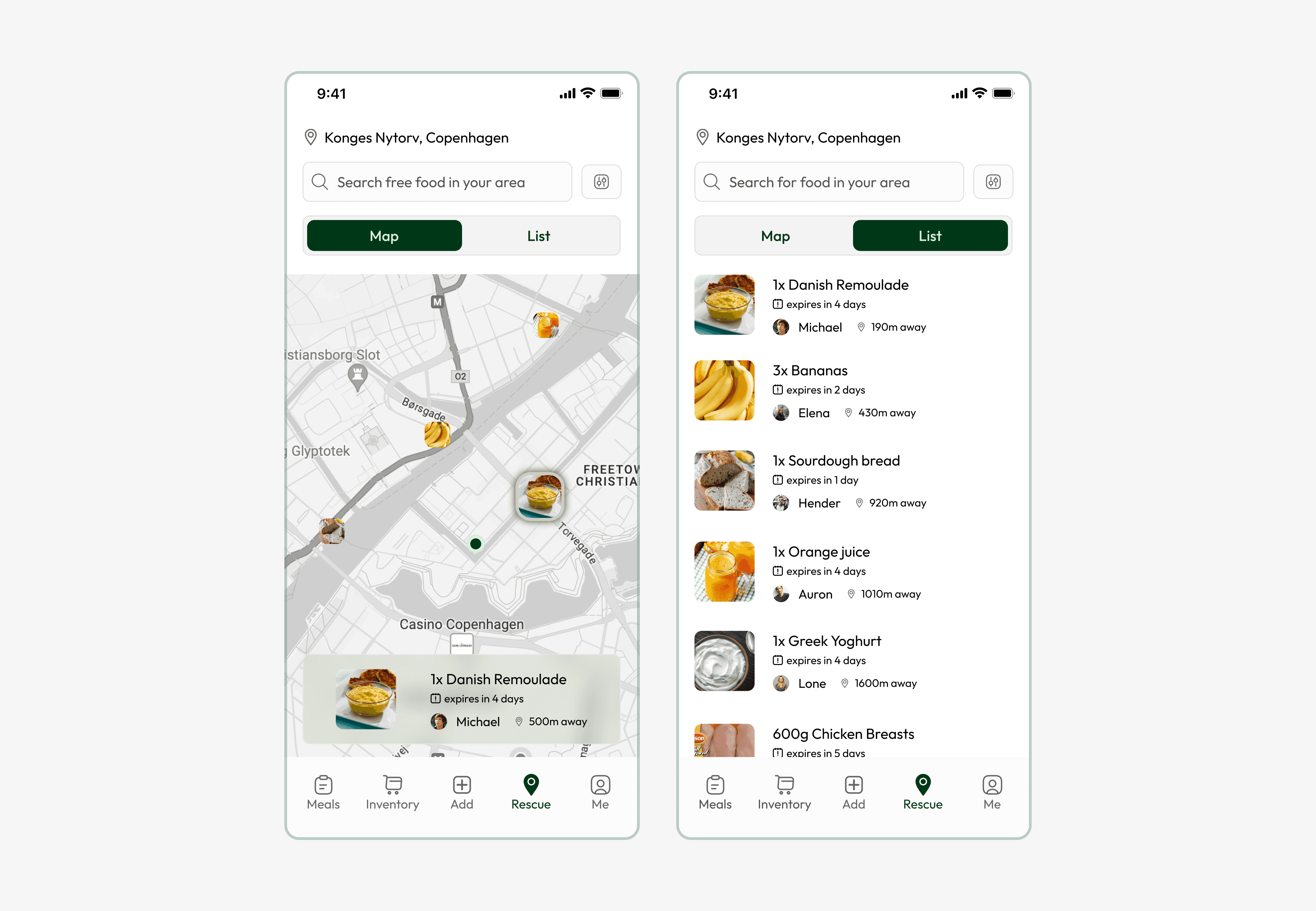
Rescue tab
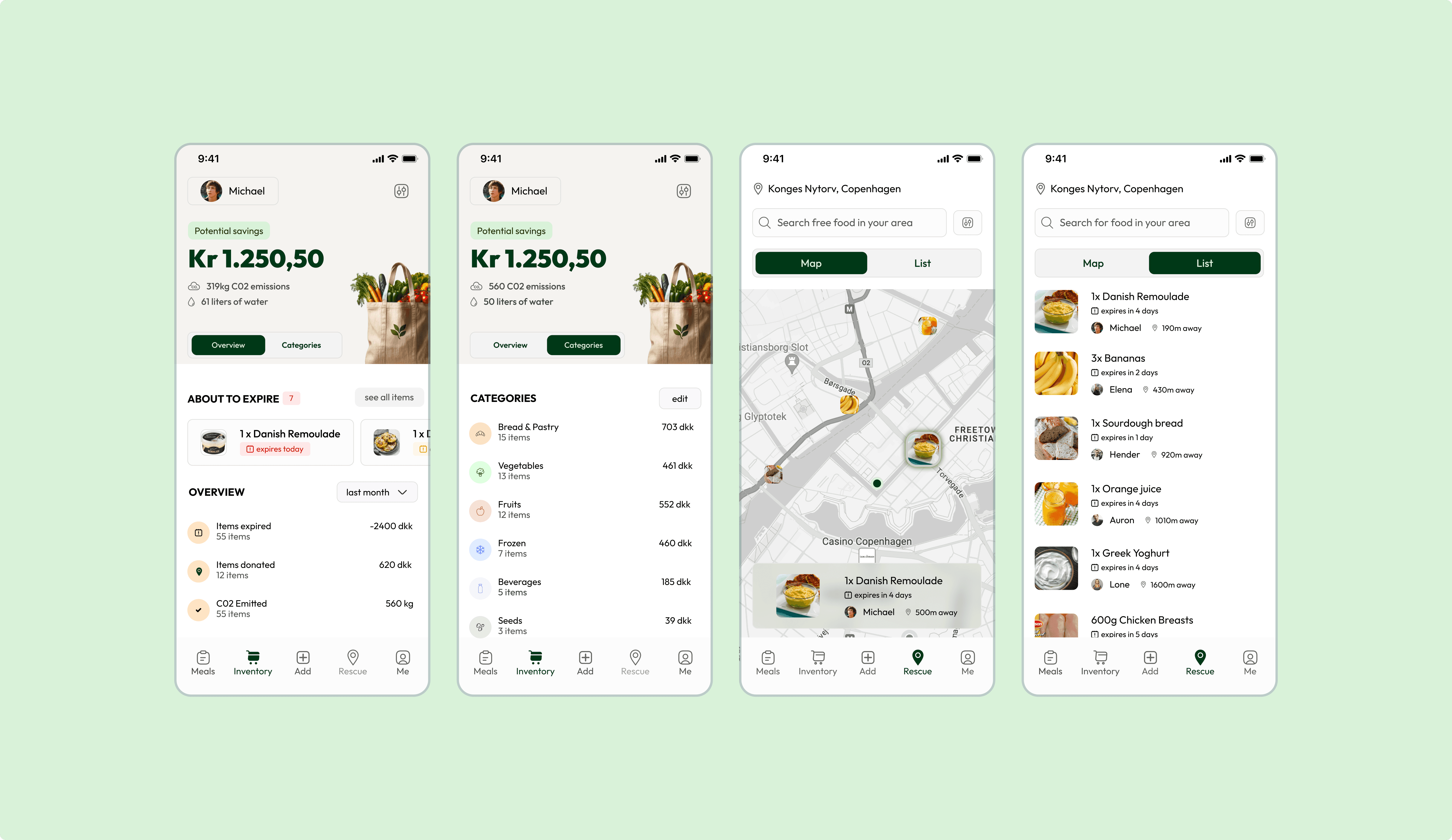
Users can offer food they won't consume, which would otherwise spoil, or claim items from others.
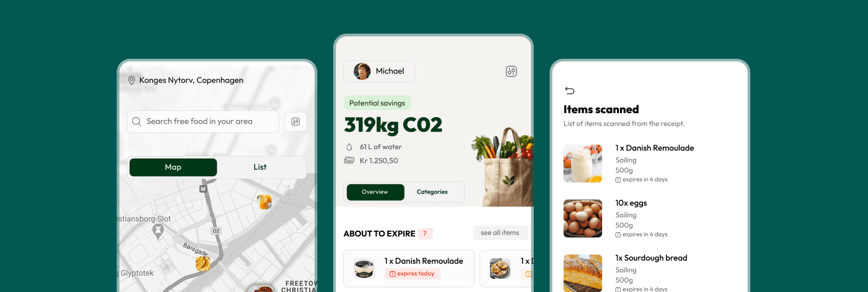
This feature provides both map and list views, including details like food information, distance, and expiration date.
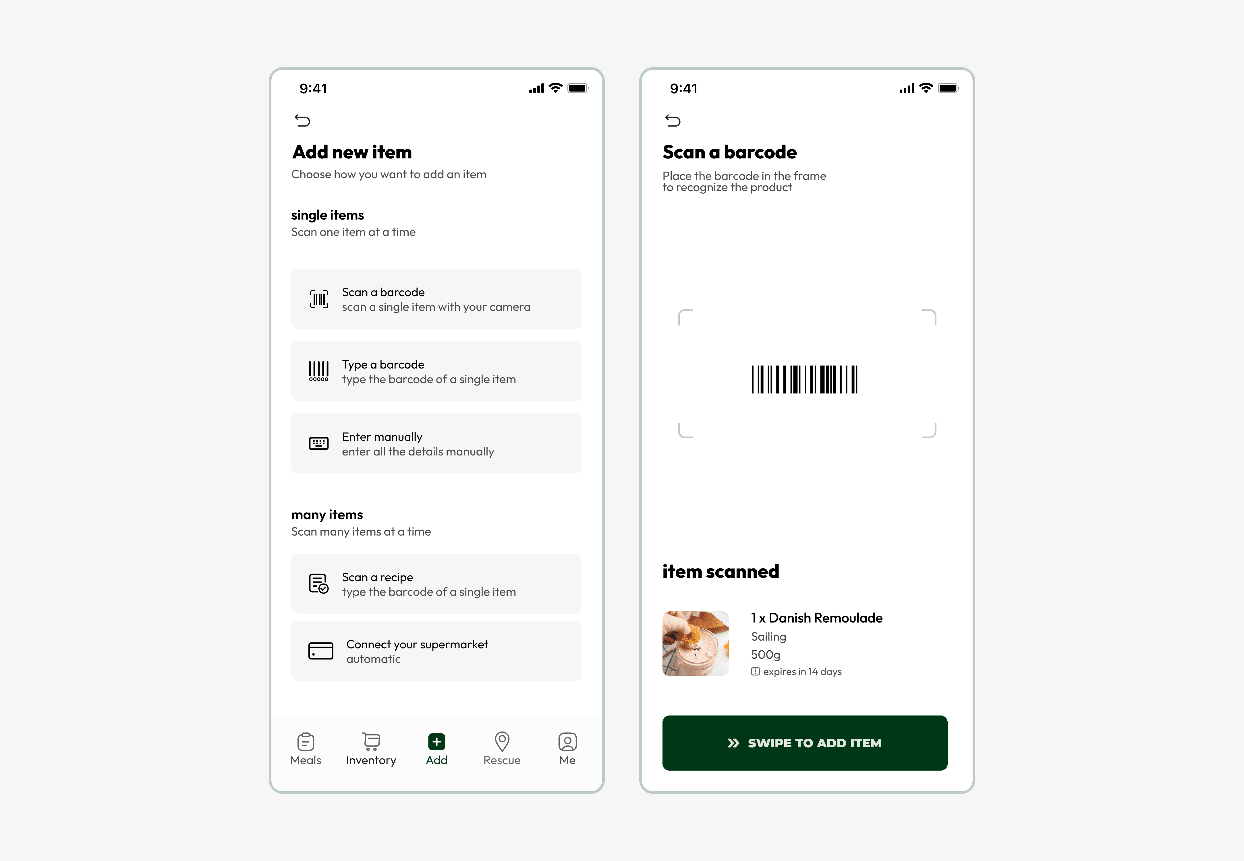
Add tab
Users have the choice to manually add an item or link to the supermarket's official app for automatic updates on their purchases.
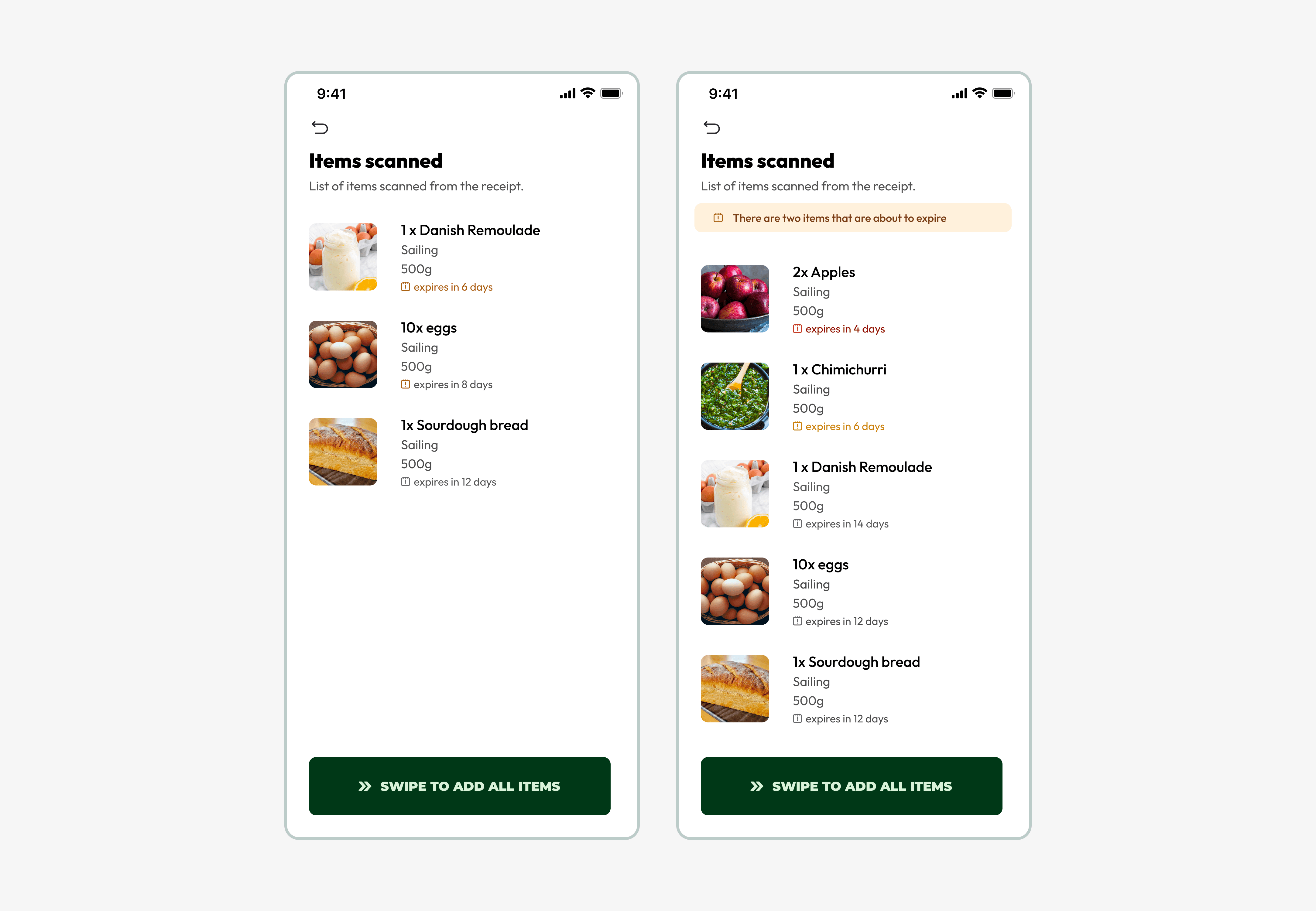
Scanned Items
Once items are scanned, the system suggests which products may expire soon.
Overview tab
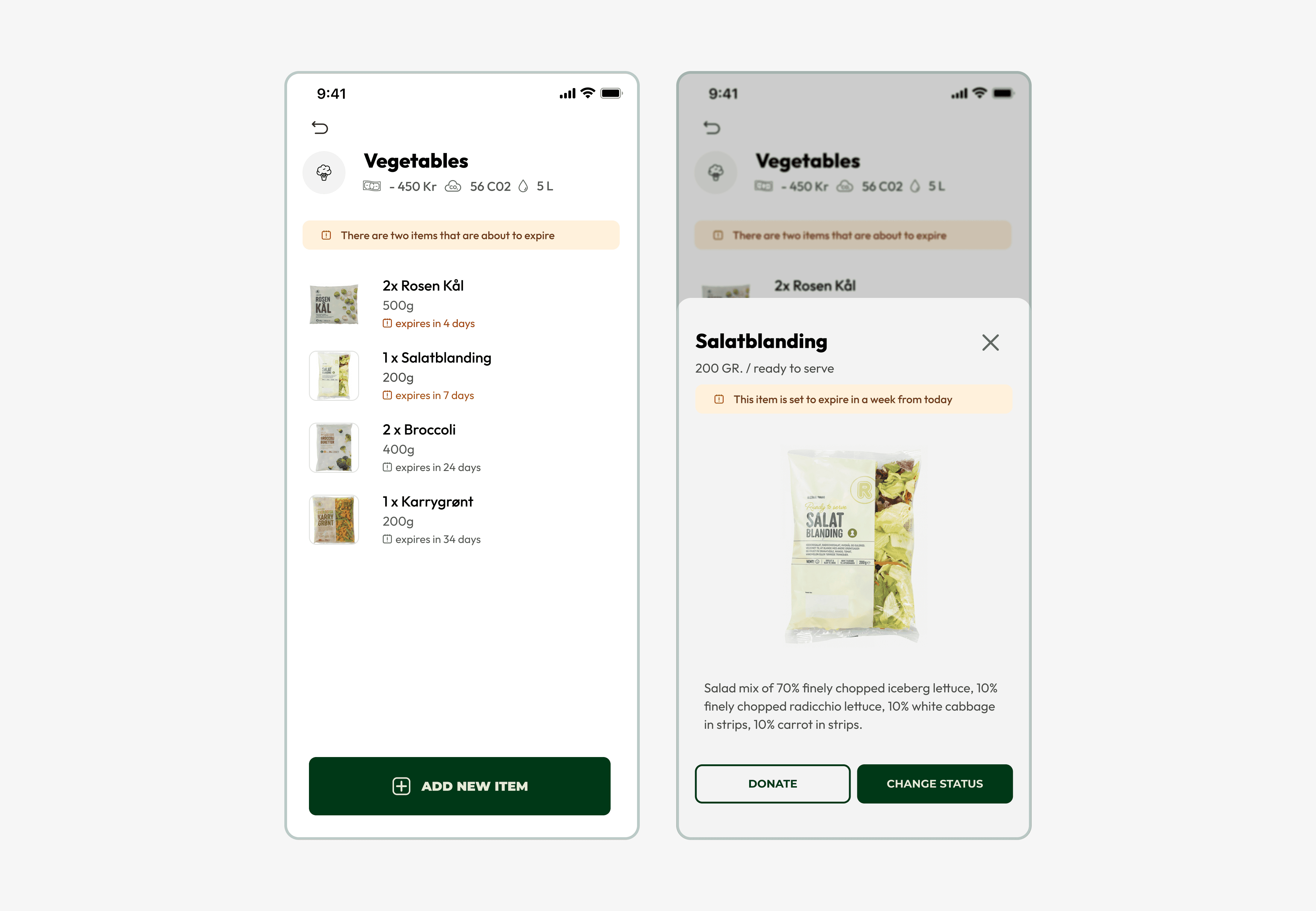
Provides users with a summary of what they would have otherwise wasted if they hadn't consumed or donated the food from their household:
Money saved
CO2 emissions
Liters of water
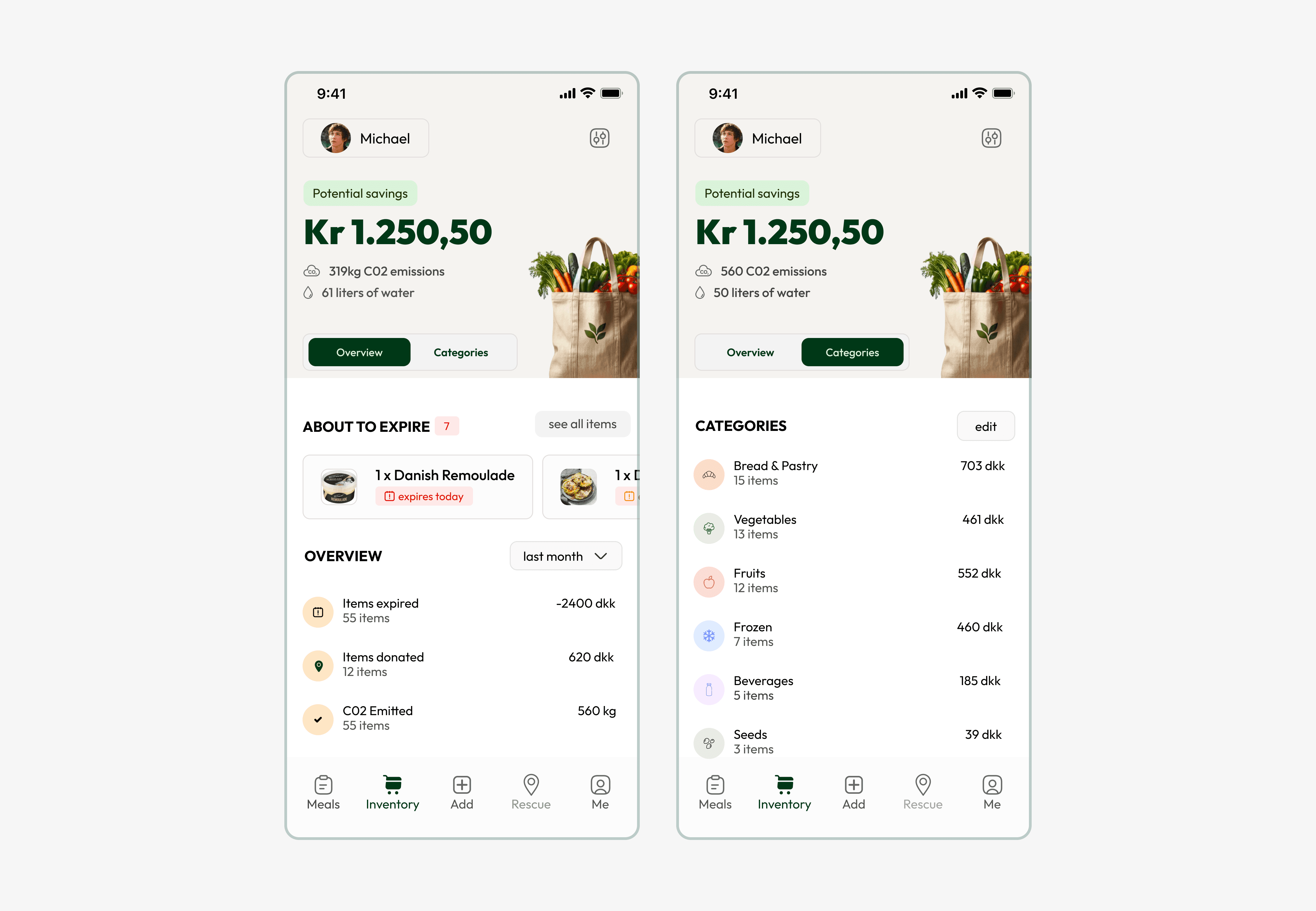
Categories List
It demonstrates how simple it is to donate an item or update the status of an item to consumed, spoiled, or donated.
Testing and User Feedback
Once the entire team is satisfied with the implementation, the next phase involves user testing, which can be conducted through platforms like Useberry.
For this test, I initially ask users to complete just one task, although the platform allows for configuring multiple tasks, posing questions after the test, and analyzing overall usage statistics.
Developer Handling
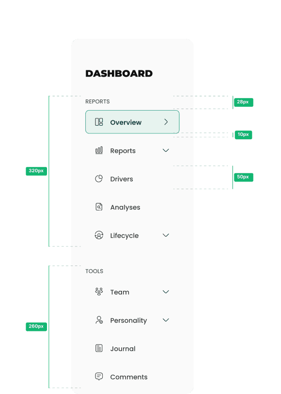
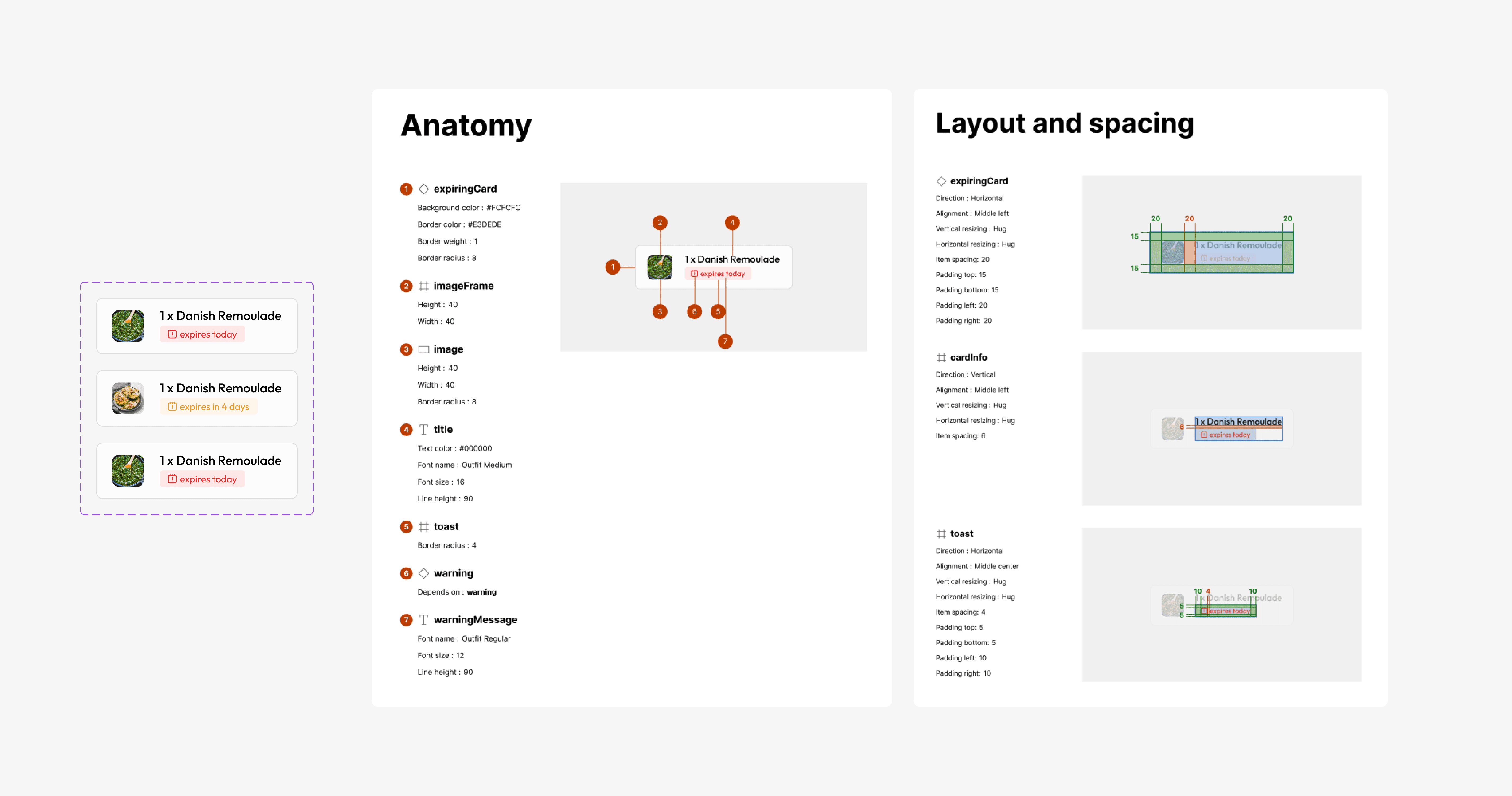
7a. Dimensions and Specifications
I'm convinced that clear communication between designers and developers is essential for creating a great product. Properly documenting the product's specifications plays a key role in bridging gaps and avoiding misunderstandings, ensuring the final product aligns closely with the original designs.
7b. Ticket Specifications
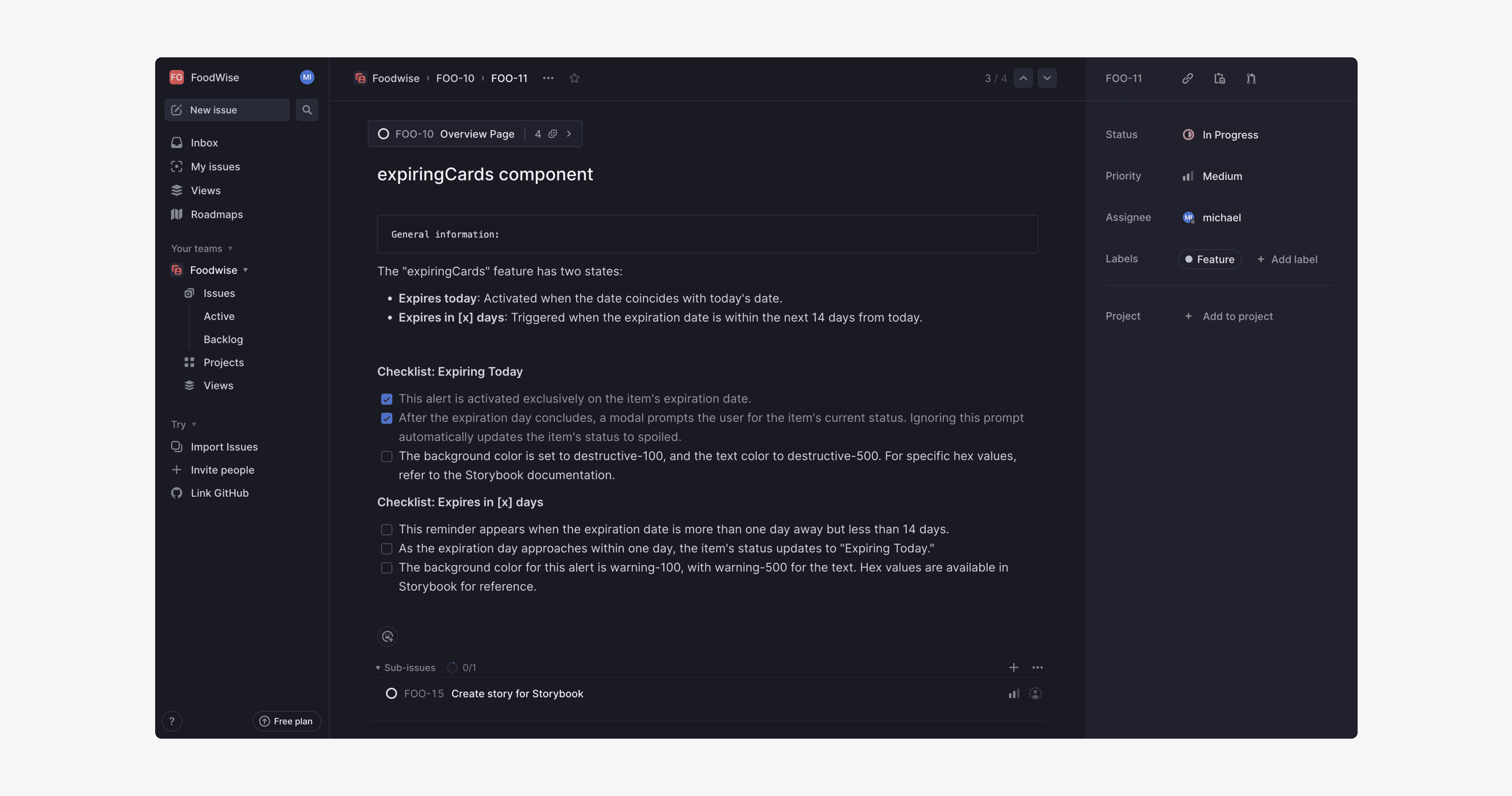
In my effort to ensure effective communication with developers, I write tickets that are actionable and clearly describe the status of each element, all while being part of a broader "epic" ticket.
This approach has significantly sped up development by clarifying any potential ambiguities and addressing questions developers might have about a feature upfront. Ultimately, this practice fosters a more collaborative and efficient designer-developer experience.
7c. Optional: Storybook Implementation
One tool that I feel notably enhances collaboration between designers and developers is Storybook. Integrating Storybook with Chromatic facilitates a seamless partnership, allowing both teams to work closely and review changes before they are deployed to production.
It's a great way to ensure we're on the same page, streamlining our work and keeping everyone in the loop.

Continuous Evolution
Launching the product is just the beginning of an ongoing journey. After it goes live, I stay on top of gathering user feedback, diving into how the product's being used utilizing different tools such as analytics, heatmaps, and pinpointing areas that need work.
This cycle of test, learn, and tweak is key to making sure our product doesn't just stay in the game but also keeps improving.

I hope this gives you a good sense of how I operate and collaborate across teams.
From the initial user research and wireframe sketches all the way to polished designs, I emphasize clear communication with developers to bridge any gaps. This approach helps us achieve a win-win: a product that delights users and meets our business objectives.

SEE MY OTHER PROJECTS
FOODWISE
Manage your groceries, minimize food waste, and contribute to your community with FoodWise
Introduction
This project is meant to showcase my design and thought process. I divided it in seven stages:
Identifying the Problem: I start with a deep dive into the issues people are facing. It’s about understanding the core of the problem through direct.
Understanding Users: Next, I focus on truly getting to know the users. Using interviews, surveys, and direct observations, I gather insights that become the backbone of our design process.
Idea Generation: With a solid grasp of user needs, I move on to brainstorming. This stage is about creativity—thinking up various ways to solve the problems. I then select the most viable solutions based on what I’ve learned from the users.
Designing the Solution: Here, I take the best ideas and turn them into tangible designs. Using Figma, I develop everything from the initial sketches to fully interactive prototypes. This process ensures our designs are both intuitive and visually appealing.
Testing and Improving: Testing the designs with actual users is crucial. Their feedback allows us to make necessary adjustments, ensuring that the final product is not just visually appealing but truly meets user needs.
Developer handling: Collaboration with developers and other team members is key to bringing our designs to life. I use Figma and a tools like Linear for tickets to ensure a smooth transition from design to development, focusing on clear communication and detailed documentation.
Continuous Evolution: The launch of our product isn't the end, it's part of an ongoing process. After release, we continue to gather user feedback, analyze how the product is used, and identify areas for improvement. This cycle of testing, learning, and iterating ensures that our product not only stays relevant but also keeps getting better.
Problem Statement
2a. Identifying the Problem
Many people often find themselves throwing away uneaten food because they forget it's in their fridge or pantry, or they miss the expiration date. This not only leads to a significant amount of food waste but also contributes to unnecessary spending on groceries that aren't consumed.
2b. Initial thoughts, hypotheses & goals
Initial Thoughts
⤑ Food waste at the consumer level is a significant issue, often due to poor inventory management at home.
⤑ People might be unaware of what they have in their homes or when items expire.
⤑ There's potential for a solution that helps track food inventory and expiration dates in a user-friendly manner.
Hypotheses
⤑ Many individuals unintentionally waste food because they lose track of what they have bought or when it expires.
⤑ A tool that helps people easily track their food inventory and expiration dates will reduce the amount of food wasted.
⤑ People prefer a digital solution to help manage their food inventory over traditional methods like manual lists or memory.
Goals
⤑ Understand the extent of food waste due to forgotten inventory or expired products in households.
⤑ Identify the most common challenges people face in managing their food inventory.
⤑ Explore the acceptance and preferred features of a digital solution for managing food inventory and expiration dates.
Understanding the user
For this project, I utilized one exploratory method: interviews.
These interviews were unstructured and open-ended, allowing for a comprehensive understanding of user behavior.
To keep this user research concise and avoid delving into excessive detail, I have not included the individual user interviews. Instead, I present the findings from them, which led to the identification of three user personas:
⤑ User Persona 1: The Eco-Curious Novice
⤑ User Persona 2: The Busy Eco-Warrior
⤑ User Persona 3: The Practical Student
Among these personas, I decided to focus on the first two. The Practical Student, due to their limited interest in environmental causes and preference for using fewer apps, may not be the ideal fit for this project's emphasis on reducing food waste and enhancing community sharing features.
The findings are available on the following Miro Board:

Idea generation
Idea: Food Tracking and Sharing App
A user-friendly app designed to help you manage your groceries, minimize food waste, and engage with your community by tracking your purchases, alerting you to expiration dates, suggesting recipes for leftover ingredients, and enabling you to donate or rescue surplus food within a community-driven platform.
4a. Sitemap
I designed a sitemap that outlines the necessary features to kick off the project:
⤑ Inventory: Keeps track of all your food items and their expiration dates.
⤑ Add: Allows you to input new items.
⤑ Rescue: Enables you to donate or claim food from others that's about to expire.
⤑ Meals: Provides suggestions for meals you can prepare with what you have.
⤑ Profile: Contains options to customize your profile.

4c. Low-fidelity wireframes
With the sitemap laid out, I start creating wireframes for the initial screens, which will serve as a roadmap for developing the rest of the features.

Designing the Solution
5a. Brand Identity & Components
Using the user persona as guidance, I began shaping the brand's visual identity, focusing on color choices and typography. In line with color psychology principles relevant to this project, I selected various shades of green to symbolize sustainability and tranquility. After setting the primary colors, I proceeded to develop the rest of the color palette.

5b. Components
After selecting the typography and colors, I moved on to designing the reusable components for the project.

5c. Hight Fidelity designs
Once satisfied with the wireframes, I transition to crafting the final designs.
Rescue tab
Users can offer food they won't consume, which would otherwise spoil, or claim items from others.
This feature provides both map and list views, including details like food information, distance, and expiration date.

Add tab
Users have the choice to manually add an item or link to the supermarket's official app for automatic updates on their purchases.

Scanned Items
Once items are scanned, the system suggests which products may expire soon.

Overview tab
Provides users with a summary of what they would have otherwise wasted if they hadn't consumed or donated the food from their household:
Money saved
CO2 emissions
Liters of water

Categories List
It demonstrates how simple it is to donate an item or update the status of an item to consumed, spoiled, or donated.

Testing and User Feedback
Once the entire team is satisfied with the implementation, the next phase involves user testing, which can be conducted through platforms like Useberry.
For this test, I initially ask users to complete just one task, although the platform allows for configuring multiple tasks, posing questions after the test, and analyzing overall usage statistics.
Developer Handling
7a. Dimensions and Specifications
I'm convinced that clear communication between designers and developers is essential for creating a great product. Properly documenting the product's specifications plays a key role in bridging gaps and avoiding misunderstandings, ensuring the final product aligns closely with the original designs.

7b. Ticket Specifications
In my effort to ensure effective communication with developers, I write tickets that are actionable and clearly describe the status of each element, all while being part of a broader "epic" ticket.
This approach has significantly sped up development by clarifying any potential ambiguities and addressing questions developers might have about a feature upfront. Ultimately, this practice fosters a more collaborative and efficient designer-developer experience.

7c. Optional: Storybook Implementation
One tool that I feel notably enhances collaboration between designers and developers is Storybook. Integrating Storybook with Chromatic facilitates a seamless partnership, allowing both teams to work closely and review changes before they are deployed to production.
It's a great way to ensure we're on the same page, streamlining our work and keeping everyone in the loop.

Continuous Evolution
Launching the product is just the beginning of an ongoing journey. After it goes live, I stay on top of gathering user feedback, diving into how the product's being used utilizing different tools such as analytics, heatmaps, and pinpointing areas that need work.
This cycle of test, learn, and tweak is key to making sure our product doesn't just stay in the game but also keeps improving.

I hope this gives you a good sense of how I operate and collaborate across teams.
From the initial user research and wireframe sketches all the way to polished designs, I emphasize clear communication with developers to bridge any gaps. This approach helps us achieve a win-win: a product that delights users and meets our business objectives.

SEE MY OTHER PROJECTS
FOODWISE
Manage your groceries, minimize food waste, and contribute to your community with FoodWise

Introduction
This project is meant to showcase my design and thought process. I divided it in seven stages:
Identifying the Problem: I start with a deep dive into the issues people are facing. It’s about understanding the core of the problem through direct.
Understanding Users: Next, I focus on truly getting to know the users. Using interviews, surveys, and direct observations, I gather insights that become the backbone of our design process.
Idea Generation: With a solid grasp of user needs, I move on to brainstorming. This stage is about creativity—thinking up various ways to solve the problems. I then select the most viable solutions based on what I’ve learned from the users.
Designing the Solution: Here, I take the best ideas and turn them into tangible designs. Using Figma, I develop everything from the initial sketches to fully interactive prototypes. This process ensures our designs are both intuitive and visually appealing.
Testing and Improving: Testing the designs with actual users is crucial. Their feedback allows us to make necessary adjustments, ensuring that the final product is not just visually appealing but truly meets user needs.
Developer handling: Collaboration with developers and other team members is key to bringing our designs to life. I use Figma and a tools like Linear for tickets to ensure a smooth transition from design to development, focusing on clear communication and detailed documentation.
Continuous Evolution: The launch of our product isn't the end, it's part of an ongoing process. After release, we continue to gather user feedback, analyze how the product is used, and identify areas for improvement. This cycle of testing, learning, and iterating ensures that our product not only stays relevant but also keeps getting better.
Problem Statement
2a. Identifying the Problem
Many people often find themselves throwing away uneaten food because they forget it's in their fridge or pantry, or they miss the expiration date. This not only leads to a significant amount of food waste but also contributes to unnecessary spending on groceries that aren't consumed.
2b. Initial thoughts, hypotheses & goals
Initial Thoughts
⤑ Food waste at the consumer level is a significant issue, often due to poor inventory management at home.
⤑ People might be unaware of what they have in their homes or when items expire.
⤑ There's potential for a solution that helps track food inventory and expiration dates in a user-friendly manner.
Hypotheses
⤑ Many individuals unintentionally waste food because they lose track of what they have bought or when it expires.
⤑ A tool that helps people easily track their food inventory and expiration dates will reduce the amount of food wasted.
⤑ People prefer a digital solution to help manage their food inventory over traditional methods like manual lists or memory.
Goals
⤑ Understand the extent of food waste due to forgotten inventory or expired products in households.
⤑ Identify the most common challenges people face in managing their food inventory.
⤑ Explore the acceptance and preferred features of a digital solution for managing food inventory and expiration dates.
Understanding the user
For this project, I utilized one exploratory method: interviews.
These interviews were unstructured and open-ended, allowing for a comprehensive understanding of user behavior.
To keep this user research concise and avoid delving into excessive detail, I have not included the individual user interviews. Instead, I present the findings from them, which led to the identification of three user personas:
⤑ User Persona 1: The Eco-Curious Novice
⤑ User Persona 2: The Busy Eco-Warrior
⤑ User Persona 3: The Practical Student
Among these personas, I decided to focus on the first two. The Practical Student, due to their limited interest in environmental causes and preference for using fewer apps, may not be the ideal fit for this project's emphasis on reducing food waste and enhancing community sharing features.
The findings are available on the following Miro Board:

Idea generation
Idea: Food Tracking and Sharing App
A user-friendly app designed to help you manage your groceries, minimize food waste, and engage with your community by tracking your purchases, alerting you to expiration dates, suggesting recipes for leftover ingredients, and enabling you to donate or rescue surplus food within a community-driven platform.
4a. Sitemap
I designed a sitemap that outlines the necessary features to kick off the project:
⤑ Inventory: Keeps track of all your food items and their expiration dates.
⤑ Add: Allows you to input new items.
⤑ Rescue: Enables you to donate or claim food from others that's about to expire.
⤑ Meals: Provides suggestions for meals you can prepare with what you have.
⤑ Profile: Contains options to customize your profile.

4c. Low-fidelity wireframes
With the sitemap laid out, I start creating wireframes for the initial screens, which will serve as a roadmap for developing the rest of the features.

Designing the Solution
5a. Brand Identity & Components
Using the user persona as guidance, I began shaping the brand's visual identity, focusing on color choices and typography. In line with color psychology principles relevant to this project, I selected various shades of green to symbolize sustainability and tranquility. After setting the primary colors, I proceeded to develop the rest of the color palette.

5b. Components
After selecting the typography and colors, I moved on to designing the reusable components for the project.

5c. Hight Fidelity designs
Once satisfied with the wireframes, I transition to crafting the final designs.
Rescue tab
Users can offer food they won't consume, which would otherwise spoil, or claim items from others.
This feature provides both map and list views, including details like food information, distance, and expiration date.

Add tab
Users have the choice to manually add an item or link to the supermarket's official app for automatic updates on their purchases.

Scanned Items
Once items are scanned, the system suggests which products may expire soon.

Overview tab
Provides users with a summary of what they would have otherwise wasted if they hadn't consumed or donated the food from their household:
Money saved
CO2 emissions
Liters of water

Categories List
It demonstrates how simple it is to donate an item or update the status of an item to consumed, spoiled, or donated.

Testing and User Feedback
Once the entire team is satisfied with the implementation, the next phase involves user testing, which can be conducted through platforms like Useberry.
For this test, I initially ask users to complete just one task, although the platform allows for configuring multiple tasks, posing questions after the test, and analyzing overall usage statistics.
Developer Handling
7a. Dimensions and Specifications
I'm convinced that clear communication between designers and developers is essential for creating a great product. Properly documenting the product's specifications plays a key role in bridging gaps and avoiding misunderstandings, ensuring the final product aligns closely with the original designs.

7b. Ticket Specifications
In my effort to ensure effective communication with developers, I write tickets that are actionable and clearly describe the status of each element, all while being part of a broader "epic" ticket.
This approach has significantly sped up development by clarifying any potential ambiguities and addressing questions developers might have about a feature upfront. Ultimately, this practice fosters a more collaborative and efficient designer-developer experience.

7c. Optional: Storybook Implementation
One tool that I feel notably enhances collaboration between designers and developers is Storybook. Integrating Storybook with Chromatic facilitates a seamless partnership, allowing both teams to work closely and review changes before they are deployed to production.
It's a great way to ensure we're on the same page, streamlining our work and keeping everyone in the loop.

Continuous Evolution
Launching the product is just the beginning of an ongoing journey. After it goes live, I stay on top of gathering user feedback, diving into how the product's being used utilizing different tools such as analytics, heatmaps, and pinpointing areas that need work.
This cycle of test, learn, and tweak is key to making sure our product doesn't just stay in the game but also keeps improving.

I hope this gives you a good sense of how I operate and collaborate across teams.
From the initial user research and wireframe sketches all the way to polished designs, I emphasize clear communication with developers to bridge any gaps. This approach helps us achieve a win-win: a product that delights users and meets our business objectives.

SEE MY OTHER PROJECTS
FOODWISE
Manage your groceries, minimize food waste, and contribute to your community with FoodWise

Introduction
This project is meant to showcase my design and thought process. I divided it in seven stages:
Identifying the Problem: I start with a deep dive into the issues people are facing. It’s about understanding the core of the problem through direct.
Understanding Users: Next, I focus on truly getting to know the users. Using interviews, surveys, and direct observations, I gather insights that become the backbone of our design process.
Idea Generation: With a solid grasp of user needs, I move on to brainstorming. This stage is about creativity—thinking up various ways to solve the problems. I then select the most viable solutions based on what I’ve learned from the users.
Designing the Solution: Here, I take the best ideas and turn them into tangible designs. Using Figma, I develop everything from the initial sketches to fully interactive prototypes. This process ensures our designs are both intuitive and visually appealing.
Testing and Improving: Testing the designs with actual users is crucial. Their feedback allows us to make necessary adjustments, ensuring that the final product is not just visually appealing but truly meets user needs.
Developer handling: Collaboration with developers and other team members is key to bringing our designs to life. I use Figma and a tools like Linear for tickets to ensure a smooth transition from design to development, focusing on clear communication and detailed documentation.
Continuous Evolution: The launch of our product isn't the end, it's part of an ongoing process. After release, we continue to gather user feedback, analyze how the product is used, and identify areas for improvement. This cycle of testing, learning, and iterating ensures that our product not only stays relevant but also keeps getting better.
Problem Statement
2a. Identifying the Problem
Many people often find themselves throwing away uneaten food because they forget it's in their fridge or pantry, or they miss the expiration date. This not only leads to a significant amount of food waste but also contributes to unnecessary spending on groceries that aren't consumed.
2b. Initial thoughts, hypotheses & goals
Initial Thoughts
⤑ Food waste at the consumer level is a significant issue, often due to poor inventory management at home.
⤑ People might be unaware of what they have in their homes or when items expire.
⤑ There's potential for a solution that helps track food inventory and expiration dates in a user-friendly manner.
Hypotheses
⤑ Many individuals unintentionally waste food because they lose track of what they have bought or when it expires.
⤑ A tool that helps people easily track their food inventory and expiration dates will reduce the amount of food wasted.
⤑ People prefer a digital solution to help manage their food inventory over traditional methods like manual lists or memory.
Goals
⤑ Understand the extent of food waste due to forgotten inventory or expired products in households.
⤑ Identify the most common challenges people face in managing their food inventory.
⤑ Explore the acceptance and preferred features of a digital solution for managing food inventory and expiration dates.
Understanding the user
For this project, I utilized one exploratory method: interviews.
These interviews were unstructured and open-ended, allowing for a comprehensive understanding of user behavior.
To keep this user research concise and avoid delving into excessive detail, I have not included the individual user interviews. Instead, I present the findings from them, which led to the identification of three user personas:
⤑ User Persona 1: The Eco-Curious Novice
⤑ User Persona 2: The Busy Eco-Warrior
⤑ User Persona 3: The Practical Student
Among these personas, I decided to focus on the first two. The Practical Student, due to their limited interest in environmental causes and preference for using fewer apps, may not be the ideal fit for this project's emphasis on reducing food waste and enhancing community sharing features.
The findings are available on the following Miro Board:

Idea generation
Idea: Food Tracking and Sharing App
A user-friendly app designed to help you manage your groceries, minimize food waste, and engage with your community by tracking your purchases, alerting you to expiration dates, suggesting recipes for leftover ingredients, and enabling you to donate or rescue surplus food within a community-driven platform.
4a. Sitemap
I designed a sitemap that outlines the necessary features to kick off the project:
⤑ Inventory: Keeps track of all your food items and their expiration dates.
⤑ Add: Allows you to input new items.
⤑ Rescue: Enables you to donate or claim food from others that's about to expire.
⤑ Meals: Provides suggestions for meals you can prepare with what you have.
⤑ Profile: Contains options to customize your profile.

4c. Low-fidelity wireframes
With the sitemap laid out, I start creating wireframes for the initial screens, which will serve as a roadmap for developing the rest of the features.

Designing the Solution
5a. Brand Identity & Components
Using the user persona as guidance, I began shaping the brand's visual identity, focusing on color choices and typography. In line with color psychology principles relevant to this project, I selected various shades of green to symbolize sustainability and tranquility. After setting the primary colors, I proceeded to develop the rest of the color palette.

5b. Components
After selecting the typography and colors, I moved on to designing the reusable components for the project.

5c. Hight Fidelity designs
Once satisfied with the wireframes, I transition to crafting the final designs.
Rescue tab
Users can offer food they won't consume, which would otherwise spoil, or claim items from others.
This feature provides both map and list views, including details like food information, distance, and expiration date.

Add tab
Users have the choice to manually add an item or link to the supermarket's official app for automatic updates on their purchases.

Scanned Items
Once items are scanned, the system suggests which products may expire soon.

Overview tab
Provides users with a summary of what they would have otherwise wasted if they hadn't consumed or donated the food from their household:
Money saved
CO2 emissions
Liters of water

Categories List
It demonstrates how simple it is to donate an item or update the status of an item to consumed, spoiled, or donated.

Testing and User Feedback
Once the entire team is satisfied with the implementation, the next phase involves user testing, which can be conducted through platforms like Useberry.
For this test, I initially ask users to complete just one task, although the platform allows for configuring multiple tasks, posing questions after the test, and analyzing overall usage statistics.
Developer Handling
7a. Dimensions and Specifications
I'm convinced that clear communication between designers and developers is essential for creating a great product. Properly documenting the product's specifications plays a key role in bridging gaps and avoiding misunderstandings, ensuring the final product aligns closely with the original designs.

7b. Ticket Specifications
In my effort to ensure effective communication with developers, I write tickets that are actionable and clearly describe the status of each element, all while being part of a broader "epic" ticket.
This approach has significantly sped up development by clarifying any potential ambiguities and addressing questions developers might have about a feature upfront. Ultimately, this practice fosters a more collaborative and efficient designer-developer experience.

7c. Optional: Storybook Implementation
One tool that I feel notably enhances collaboration between designers and developers is Storybook. Integrating Storybook with Chromatic facilitates a seamless partnership, allowing both teams to work closely and review changes before they are deployed to production.
It's a great way to ensure we're on the same page, streamlining our work and keeping everyone in the loop.

Continuous Evolution
Launching the product is just the beginning of an ongoing journey. After it goes live, I stay on top of gathering user feedback, diving into how the product's being used utilizing different tools such as analytics, heatmaps, and pinpointing areas that need work.
This cycle of test, learn, and tweak is key to making sure our product doesn't just stay in the game but also keeps improving.

I hope this gives you a good sense of how I operate and collaborate across teams.
From the initial user research and wireframe sketches all the way to polished designs, I emphasize clear communication with developers to bridge any gaps. This approach helps us achieve a win-win: a product that delights users and meets our business objectives.
